There are many ways you can design your nonprofit website, but you’ll need to stick to best practices to create a strong digital presence. Let’s begin.
Your nonprofit’s website is an important marketing tool. With a well-designed website, your organisation can boost its brand visibility, introduce new supporters to your nonprofit, and keep existing supporters engaged. However, designing a website can feel daunting if you don’t have previous web design experience.
From creating a user-friendly donation page to generating high-quality content that accurately represents your mission, your nonprofit’s staff might encounter some challenges. Plus, it’s easy to overcomplicate or oversimplify your website design if you don’t have a concrete plan.
Let’s take a closer look at mistakes to avoid so you’ll be prepared to make the best website design possible:
- Mistake #1: Confusing navigation
- Mistake #2: Inaccessible content
- Mistake #3: Inconsistent branding
When you understand what your nonprofit’s website shouldn’t include, you’ll become more in tune with what makes a website successful and can incorporate these best practices into your own web design. Let’s begin!
Mistake #1: Confusing navigation
Picture this: A prospective supporter lands on your nonprofit’s website. After looking around for a brief moment, they can’t find your organisation’s mission statement, contact information, or even donation page. Plus, all of the elements on the homepage are so cluttered that the visitor quickly becomes overwhelmed. As a result, they click off of your site to search for a different organisation to support.
This is an all too common mistake. To avoid this problem for your nonprofit, implement one of the top web design best practices: prioritise intuitive navigation. Use these tips so your supporters can navigate around your site with ease:
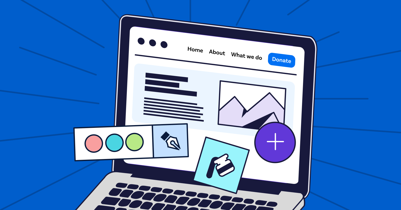
- Create a menu. Take advantage of the space in your header and footer to offer supporters a menu with links that will direct them to important pages throughout your site. If your organisation has several links that are important to include in the menu, consider creating a mega menu. In a mega menu, you can create dropdown lists that group pages into categories.
- Add ample white space. If your on-page elements are right on top of each other, your site visitors might have difficulty reading your content and will likely lose interest. Create reasonable space between each element so visitors can focus on engaging with each section on your site.
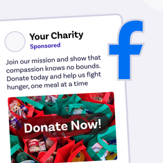
- Use call-to-action buttons. Call-to-action (CTA) buttons help prospective supporters understand their next steps and how they can engage with and support your nonprofit. For example, you can create a button in the header of your website that says “Donate now” or “Subscribe to our email newsletter.” Bring attention to your CTAs by bolding the font or highlighting the button in a distinct colour.
Closely consider your audience as you design your website. By prioritising a smooth navigation experience, prospective supporters will be more likely to explore your content and look for ways to actively engage with your cause.
Mistake #2: Inaccessible content
As you generate content, think closely about who is able to engage with it. Would people with hearing or visual impairments be able to fully explore your site? What about site visitors who can’t use a mouse and need keyboard functionality to fill out your donation page?
Creating content that is accessible to people of all abilities can help your nonprofit attract new, diverse audiences and increase your website’s ranking on search engines. Plus, your nonprofit will be able to create an inclusive community and culture, leading to more long-term support.
According to Morweb’s guide to nonprofit web accessibility, your nonprofit should incorporate the following features into your website design:
- Alt text. Alt text is a brief description that summarises what an image shows and the part it plays on your site. This way, people with visual disabilities can still engage with your images and understand how it relates to the rest of your content.
- Contrast between the foreground and background. Your text should stand out boldly from the background. Ensure that there is sufficient contrast between the foreground and background colours so your content is easily legible.
- Accessibility widget. An accessibility widget allows users to adjust your website’s display to their unique needs. Specifically, users should be able to increase the font size, change colours to greyscale, highlight links, and adjust the font type to regular non-serif.
To add an accessibility widget and apply other accessibility best practices, work with a nonprofit-specific CMS. A CMS makes it easy to adhere to the Web Content Accessibility Guidelines (WCAG), which provide recommendations for all websites to make the web more inclusive. The WCAG are frequently updated, so work with a trusted website builder that will help you achieve compliance.
Mistake #3: Inconsistent branding
If your website is generic and looks like it could belong to any organisation, site visitors will be less likely to see your nonprofit as credible. Plus, they’ll be unable to form an emotional connection with your cause or feel compelled to explore the content on your site. As a result, your nonprofit will lose out on key support and donations, making it more difficult to advance your mission.
This is where a branded website design becomes invaluable. According to Kwala, nonprofit branding is a form of visual storytelling that conveys why your organisation is worthy of donors’ support. In order to successfully establish your identity online and make your website unique to your nonprofit, you’ll need to add the following branded elements:
- Font. When selecting fonts for your headers and body content, the most critical aspect to consider is readability. Many nonprofits use sans serif fonts, like Arial or Helvetica, because of their clear lines and legibility. Once you select your fonts, use them consistently throughout your site.
- Colour scheme. Colours elicit emotions and can help supporters associate your nonprofit with different feelings. For example, many environmental organisations use green in their colour palette because of its association with the Earth. Work with colours that compliment each other and speak to your nonprofit’s cause.
- Logo. Your logo should be simple, memorable, and relevant to your nonprofit’s mission and values. While you shouldn’t overcomplicate it, feel free to get creative and come up with a design that anyone will immediately associate with your nonprofit. Feature your logo prominently on your homepage and consistently across your site.
- Visuals. High quality visuals can show supporters the tangible impact of their contributions when they give to your organisation. For example, an animal welfare organisation can show photos of dogs that were successfully adopted by grateful families thanks to donors’ support or include a video with testimonies from volunteers and donors explaining why they support your organisation.
As you come up with these branded elements, make a record of it so that everyone on your nonprofit’s team is up to date. This way, they can incorporate your branding into your other marketing materials beyond your website design, such as social media posts and direct mail.
Your nonprofit website is a tool that can significantly advance your mission, but only with a strong design. Ensure that your website accurately reflects your nonprofit’s mission and prioritises a positive user experience so everyone can engage with your content. To streamline the web design process and reduce your administrative burden, work with a nonprofit CMS that has all the features your organisation will need.