Struggling to choose a font for fundraising? We’re here to help. Find out more about fonts for non-profits - and how to choose one for your next campaign.
You know that old expression: “You can’t choose your family, but you can choose your font.”
Never heard it? Well, it’s true!
Your organisation has its own distinct personality and style. Thanks to the wonders of modern technology, you can represent it with every word you type!
But how do you choose a fundraising font to suit your brand? It’s all about knowing your options.
Let’s start at the beginning…
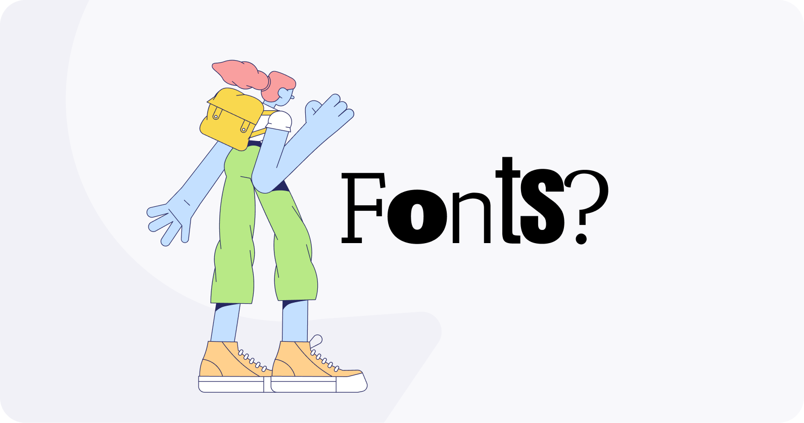
What are fonts?
Let's explore the wonderful world of fonts and typography.
Firstly- fonts are a system of letters and characters.
Just like you and me, all fonts are unique!
Each font system includes a base font with the option of different weights (e.g. bold), styles (e.g. italic), and sizing (e.g. condensed).
Now, fonts are not to be confused with Typography - the art of using type/ fonts to enable readability and accessibility.
You can do this by adjusting things like:
- type hierarchy,
- spacing,
- and how different fonts complement each other.
Terrific typography has the power to capture attention and elicit emotion.
But in everything you do, you choose a font first.. .
(Right about here is where I would make a font joke…but I’m not feeling bold enough😂)
What to consider when choosing a fundraising font.
Accessibility
Accessibility comes before creativity, always.
An accessible font will be easy to see, read, and comprehend.
Font size, colour, and spacing give you the chance to share your message clearly and efficiently.
People using screen readers (like your phone!) require easily decipherable fonts to interact with content. Improving readability will enable your organisation to reach a broader audience and provide inclusive content for people with learning, reading or sight difficulties.
Material.io has partnered with Google to provide a helpful tool to understanding font scale. Check it out here!
It’s also good idea to view your site through a browser window in a common resolution. Not sure what works? You can use a tool like whatsismyviewport to set the resolution to 1366 x 768 - a helpful size to base design upon!
Following through with this check allows you to make sure your fonts are working for your viewers …and not just you.
Mobile-Friendly Fundraising Fonts
There's no denying it; mobile phones are the dominant screens of today. Raisely's data shows that 65% of donations come from mobile devices.
(are you on your phone right now? Be honest!)
Fonts for non-profits must be mobile-friendly, with responsive typography for an easy user experience.
What is responsive typography? It’s typography that has geometric and scalable outlines. Remember, fonts are there to be read, not for pretty decoration.
We get to this later (see ‘what are the best fonts?’ below), but we suggest finding a complementary set of serif & san-serif fonts.
Serif fonts lack the aesthetic extenders on the ends of letters that serif fonts have.
Sans-serif tends to look more modern and these fonts are easier to read on titles, buttons, and short texts.
💡 A friendly font tip: Test out your typography across a range of devices. Trial everything your audience may use to peruse your content – from mobile phones to smart TVs.
Usage
If your organisation requires content for print and web, can you use the same font?
While they may be similar in design, there are differences in web-based vs. print-based fonts. Web-based fonts are optimised for being read on-screen.
They need to adapt and perform across various digital forums.
It is also worth thinking about your appeal's target audience (age, location, language).
Will your choice of font for this fundraiser appeal to them?
Hierarchy
Once your charity’s font is ready, planning the hierarchy is your next step.
As our trusty dictionary says: Hierarchy enhances flow and assists the viewer/reader in following the text.
Hang on a second, you say. ‘Hierarchy? Are some fonts more important than others?’
Well…yes!
Website visitors often only scan headlines and focus on what interests them the most.
When you know what to look for, you will soon see that there is indeed a hierarchy in font designs all around you.
So, if you have a magazine handy, flick it open. Or, if you’re on your mobile (we see you), scroll up and down on this blog and you’ll see hierarchy in action!
You will probably spot the following hierarchy:

Typically, the flow moves from larger headings to smaller paragraph text.
Notice that the larger the text, the less that can be said.
Likewise, the smaller text allows for more words.
What are the best fonts for non-profits?
So…what makes a good charity font?
It all depends on the story you wish to tell.
There are many font categories, but two big players are serif and sans serif.
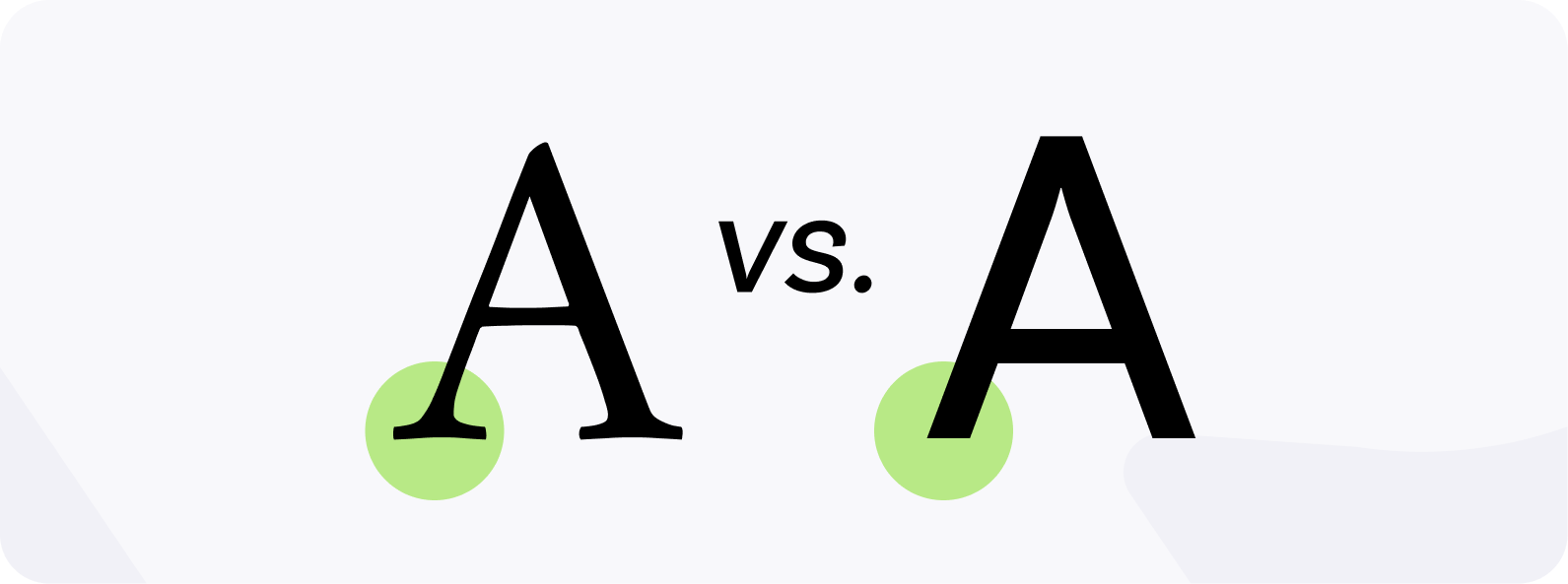
- Serif - Serif fonts are the oldest type of fonts.
For this reason, they are often perceived as classic, traditional and trustworthy.
Their name comes from the tiny decorative 'feet' ( serifs) at the top and bottom of each letter.
- Sans serif - A sans serif font does not feature any of these small flourishes.
Slightly more modern than serif fonts (19th century vs 15th century), they are defined by clean, straight lines- hence the "sans".
Both look good, so what’s good to use?
Your brand knows best!
Check your brand style guide (if your organisation has one). Otherwise, here are some helpful hints when choosing fonts for non-profits:
✏️ Accessibility comes first - choose fonts that are clear and easy to read.
✏️Use serif fonts for your headings and sans-serif for paragraphs and subheadings. It helps to find a pair that complement each other!
✏️Raisely recommends using Google Fonts for ease of use. They’re more likely to work across multiple devices (so you ensure all readers see the same style). Plus, it's free.
✏️ Create a test page to see your potential new font in situ. Include a heading, subheading, and paragraphs.
Still not sure?
If in doubt, start with something simple like Lato (Google Font).
Another crowd-pleaser is Neue Haas Grotesk (Adobe Font).
These fonts are popular for a reason.
Tried and tested by the masses, you can be sure they work on mobile devices!
For further reading, Raisely has a handy ‘understanding fonts’ support guide available.
Let's stay in touch 💜
Sign up for our newsletter if you'd like regular updates with new Raisely features, tips, and trends. We'll land in your inbox about twice a month, and you can opt out at any time.