Ensure your online donation forms are highly effective with these tips to target donors, gather the right data, and ultimately raise money.
It’s wise to create a diverse fundraising strategy for your nonprofit organisation that gives your community plenty of ways to interact with your brand and get familiar with your mission. But at some point, you need to give them a way to take their relationship with your organisation “to the next level” and become donors.
That’s right, we’re talking about your online donation forms.
This deceptively simple fundraising tool does much more than process a transaction. It sets the tone for a long and beautiful friendship — and grabs the information you’ll need to deliver it.
In this article, we’ll cover what your donation form should look like and how to optimise it for your donors' preferences and the best outcomes.
Anatomy of an Online Donation Form
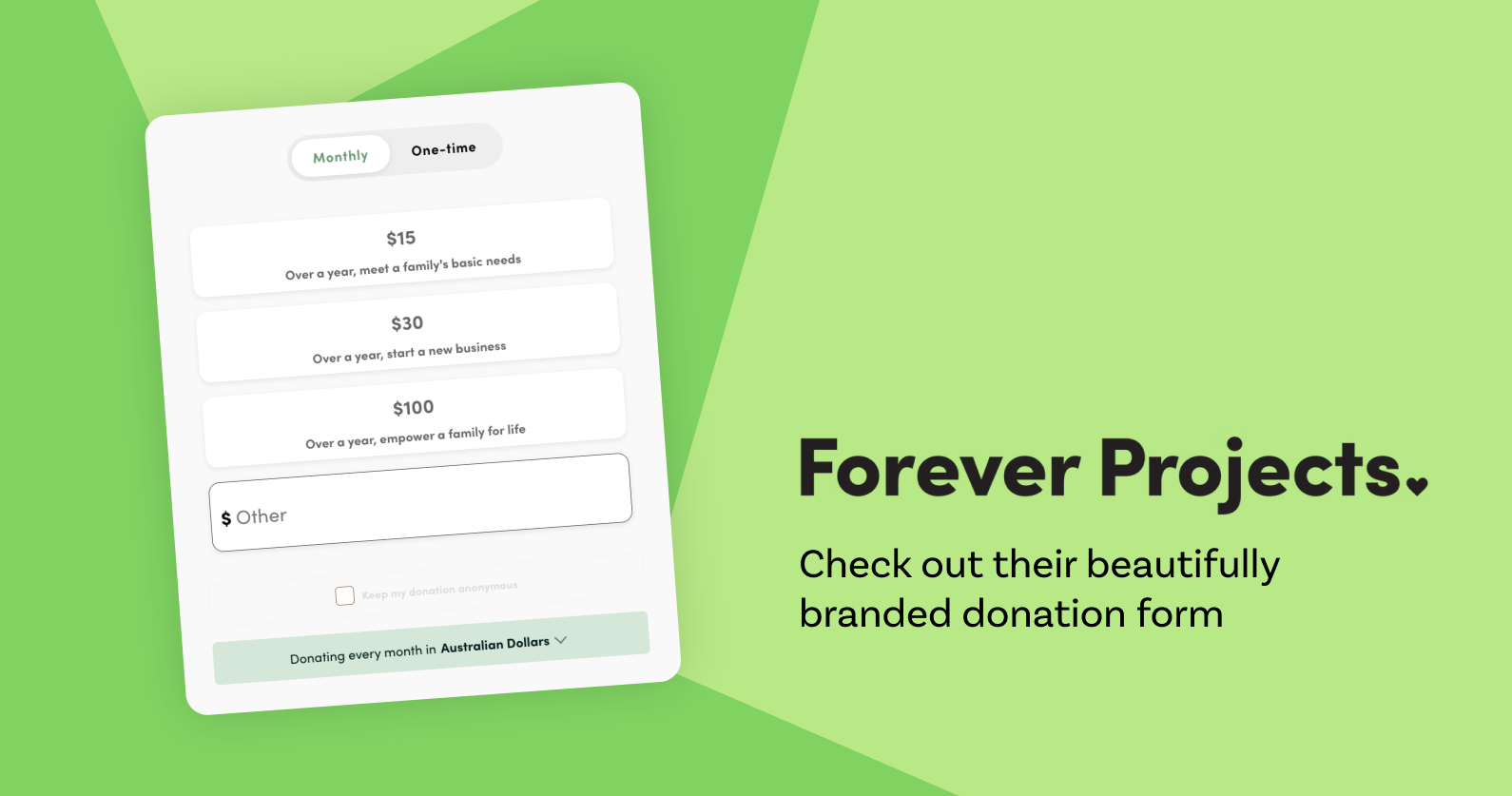
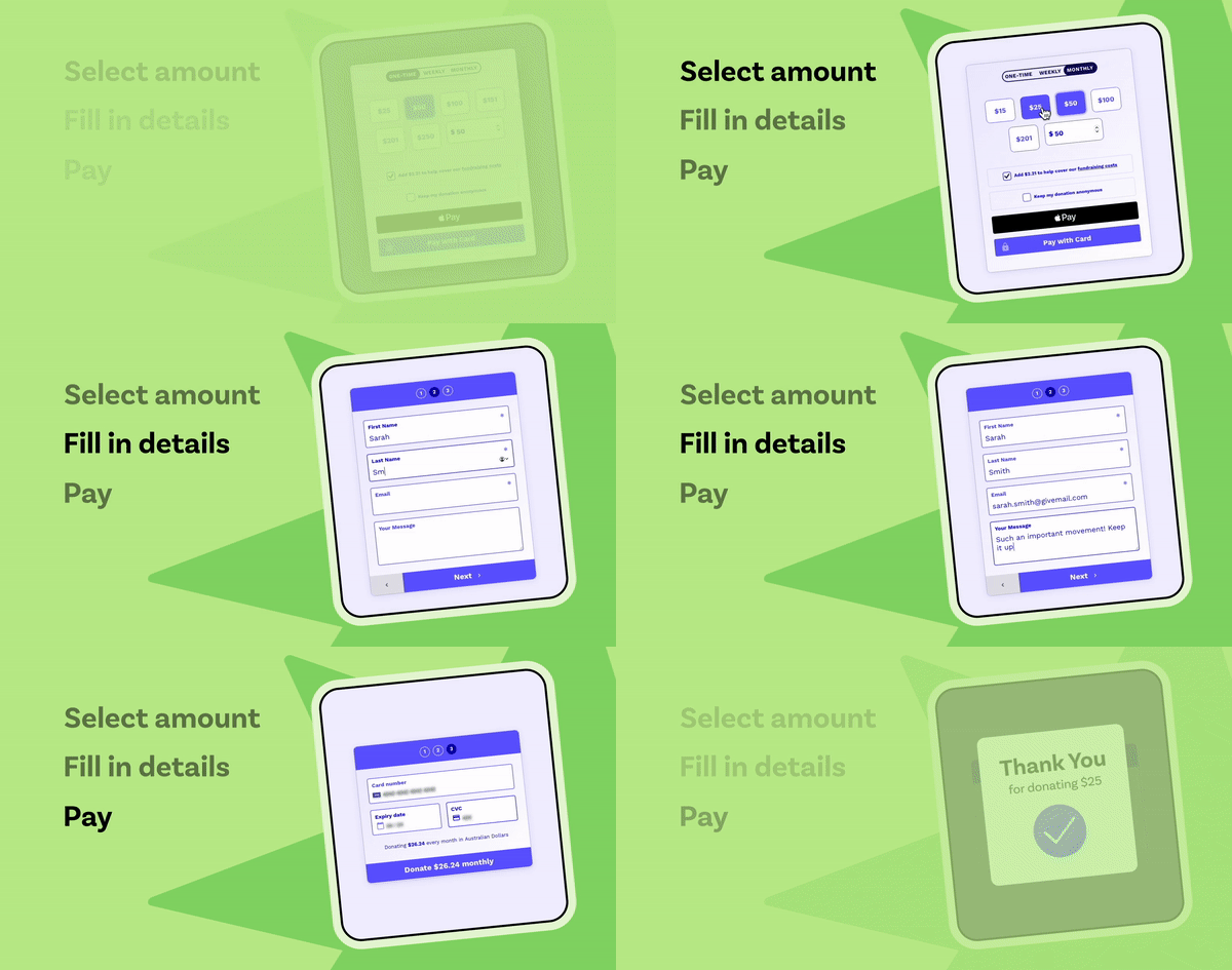
In a standard three-step fundraising form, donors choose their donation amount and frequency, enter their details, and then confirm and complete their payment. Take a look at our online donation form template to see what this looks like on Raisely. For a glimpse of a fully branded and customised online form, check out Forever Projects.

Like both of these examples, your form should include the following components:
- A simple design that includes an attention-grabbing header, a brief but compelling appeal, and imagery that showcases your impact
- Suggested giving options for the donation amount and frequency
- A few easy-to-navigate payment options
- A simple but impactful call to action for your “donate” button
These are the basics, but each of the items on this list is a variable that you’ll need to optimise for your best supporters’ preferences. For next-level insights on how to do this, read through our donation form best practices and tips.
Design a Streamlined and Strategic Online Donation Form
Think about the last time you ordered something online. How long did it take you? Was the form easy to understand? Did you get frustrated over any of the steps? Did you have to get up and walk around the house to find your credit card? Did you start getting email notifications that you didn’t sign up for?
A lot needs to happen in this quick but significant interaction. Supporters use your online donation form to choose how much and how often they’ll donate, but with each step that you add, you risk losing potential donors. Simplicity is key.
Follow these guidelines to hit all the right notes and capture donations in just a few clicks.
1. Make donors a part of your story
At the end of the day, your donors know that there are plenty of great organisations out there that they could choose to support. What’s important to them is their role in supporting your cause.
The way you present your donation request in the text and design of your online donation form should be focused on the specific donors you’re trying to reach, their perspectives, and their preferences. Instead of highlighting what your nonprofit does, talk about your impact in terms of what each donor’s contribution will accomplish.
Is one form with a broad appeal specific enough to speak to prospective donors coming to your donation page from all platforms? One single donation process and donation form may not work for the different kinds of supporters in your community or all of the fundraising campaigns in your annual strategy. It might make sense to create and test a few alternate versions or create a versatile form to embed on different versions of your fundraising pages.
2. Collect data strategically
An online donation form is a two-way exchange of information. Don’t miss the opportunity to ask for data that’ll help with stewardship and donor retention — sooner and later.
In addition to payment information, your donation form can collect any contact information and other details you like to keep in your CRM. Our visual form builder comes with handy content blocks that you can drag and drop for intuitive design and functionality without any coding.
You can make it even easier for existing contacts to donate by setting up an email marketing campaign to pre-fill your online form for them. Using Raisely’s automation features, you can personalise your fundraising page with your donor’s name, donation amount, and other information from your CRM. All they’ll have to do is enter their payment details and hit “Submit!”
3. Be clear about where the money’s going
A lot of donors are conscientious about making sure 100% of their gift goes directly to the cause they’re supporting. They want to know, what will your organisation do with these funds? Will they be divided up in any way? What other fees might apply? Winning trust and showing transparency are top priorities for your online donation form.
If you’re running a peer-to-peer fundraising campaign, make it clear that donations will count towards a specific fundraiser’s total. Also clearly indicate when matching gifts apply, as it might entice your supporters to give more!
4. Provide a few simple payment options
Your supporters may only have a couple of payment methods in their wallets — digital or otherwise — so putting the right options front and centre will help them make their choice with ease.
You’ll also want them to choose a donation amount and decide if they want to make recurring donations, making it easy to opt in without overthinking. Test different options for the suggested donation amounts and run reports after different campaigns to see which ones perform best.
Deciding which payment processors to work with can be tricky, but on the most basic level, you should be able to accept all major credit cards. We did a comparison of Stripe vs. PayPal, and we added an Express Donations feature for PayPal, Apple Pay, and Google Pay users. They can bypass most of the steps in the donation process because the form grabs their donor information directly from their wallet.
If you can, prominently include the logos of trustworthy brands like ApplePay, PayPal, or Stripe to show that transactions are secure and increase your conversion rate.
5. Streamline donation steps
Again, making your donation process simple and user-friendly is the most important thing! Don’t add too many extra questions, and only make fields required if they’re 100% necessary. Notice how our sample online donation form has pre-selected options so you can move through to the second step in just one click.
Keep in mind that your supporters need to be able to get to your donation page from all kinds of different platforms and devices. In fact, 65% of donations on the Raisely platform come through mobile devices, so make sure that your fundraising page and online donation form are responsive for a seamless user experience.

6. Test different calls to action
We don’t know about you, but clicking “Submit” doesn’t exactly fill us with joy. Test exciting calls to action for your donate button like “Give Now,” “Count Me In,” and something related to your mission, like “Save the Trees.” Now that’s more like it! Change up your calls to action, try each one for a month at a time, and track the conversions with Google Analytics to see which one performs best.
7. Bring back lost donors with retargeting
Not everyone who makes it to your online donation page will ultimately sign up to give right away, and that’s to be expected for any nonprofit organisation. Some supporters just need a bit more time or information to make their decision. Retargeting is how you lay a breadcrumb trail that brings those interested (however hesitant) donors back to your registration form. Basically, our Facebook Pixel integration identifies the visitor and feeds them ads for your fundraising campaign. Pretty neat!
Where to Put Your Donation Form
It’s a good idea to create an all-purpose online donation page to host on your website at all times, and design others around specific campaigns.
Raisely online donation forms can be embedded on any website and they’re a great place to start when using Raisely for the first time. Or you can build your entire website on Raisely with a custom domain. Consider linking your donation form as an optional step on event registration pages too. The more you link your donation forms in email appeals, newsletters, social media posts, articles, and other online materials, the more donations you’ll get!
There are ways you can create donation forms directly on social media and other platforms, and all of the tips in this article apply to those types of forms as well. Check out our new integration for seamless peer-to-peer campaigns on Facebook.
Host Your Online Donation Forms on Raisely
Your job is to make it easy for people to donate, so we make online fundraising easy for you. Raisely’s visual form builder, payment processing integrations, and CRM features were built to help you make the most of each interaction with your donation page. We’re all about connecting spirited, impactful nonprofits with the practical tools they need to create a meaningful donation experience every time.
Are you feeling inspired and ready to connect with new supporters? Sign up for free to create your first online donation form and start using it today.
Ready to create your
next campaign?

Kelsey Hoff is a content marketing specialist, freelance writer, blogger, and poet. She creates emotionally intelligent content that “listens first” for effective, ethical thought leadership.
