The essentials of an effective, easy-to-use charity website that will boost visitors, profile and funds.
Ever dream of a world where you run everything from the same platform?
We’re talking your:
🤑 Fundraising campaigns
🧾 Donation forms
🕸 Website
Oh, the simplicity. The convenience. The wonder!
It’s just you’re not exactly sure how to build a nonprofit website that encompasses everything, right?
And who’s got the time, budget and resources to manage a website revamp, anyway?
It’s easier than you think
If you’re already using Raisely for your donation forms and fundraising campaigns (or even if you’re not), you’re ready for action.
Making the leap to running everything through our platform isn’t as intimidating as you might think.
But to help you along, we’ve put together this guide on charity websites: how to set one up, what you need to include and why it’ll make life easier for you.
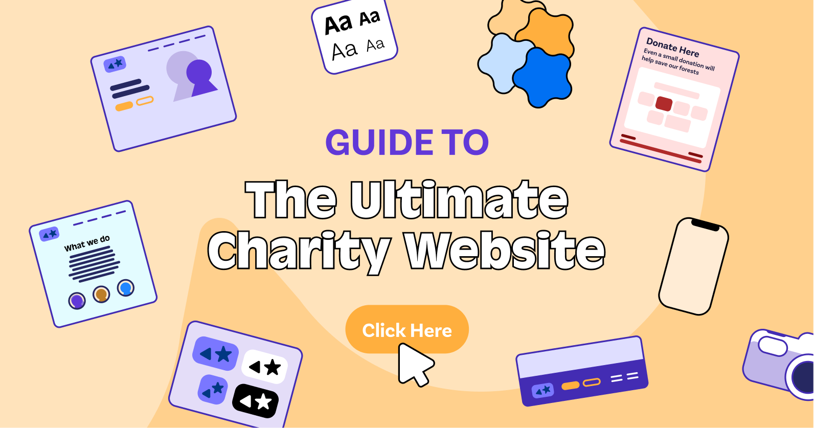
What should a nonprofit website include? Start with these core pages
Heads up: we’ve got 8 of these coming at you. Try to stick with it.
Because each one matters - and is central to how your website looks, feels and works.
Do read on 👇🏼
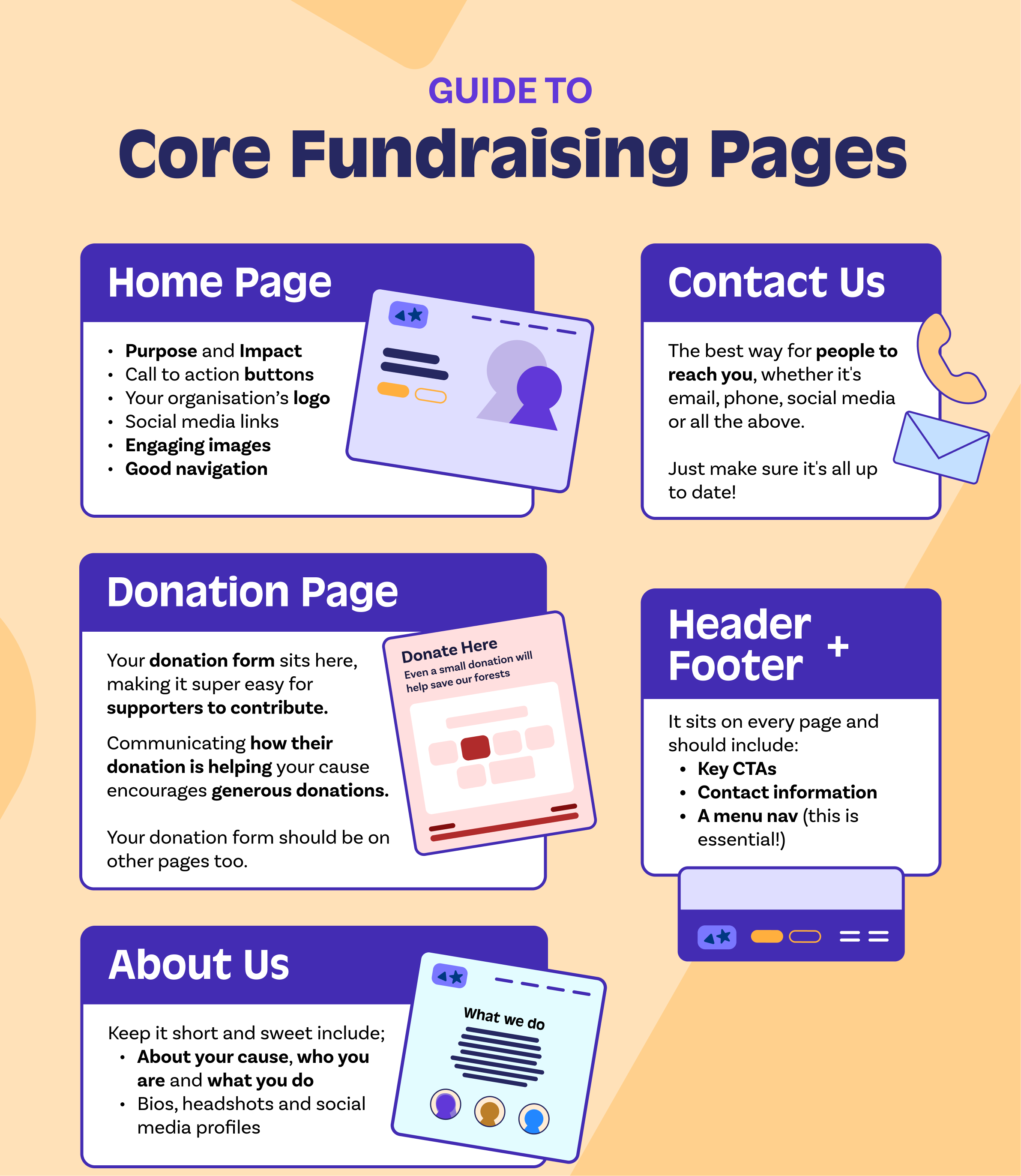
Home (page) is where the heart is
Not that we need to tell you this but…you need a home page.
And a good one at that. Why?
Because this is your organisation’s main page and one of the first things visitors see.
So, ensure you include all the important information you’d like people to see, such as:
🎯 Your purpose and impact - remind your audience why they should connect with you!
🔘 CTA buttons (e.g. ‘Learn more’ or ‘Donate now’)
🪧 Your organisation’s logo
🗣 Social media links
🌠 Engaging images that paint a picture of who you are
🧭 Good navigation so visitors can easily move around your website (they won’t stick around if they can’t find what they’re looking for).
Let’s talk…about us
Making it easy for visitors to find the about page is one thing. Keeping your story clear is another.
So make sure you tell your story straight.
Your ‘about us’ should be a straightforward explanation about your cause, who you are and what you do.
Pop in bios, headshots and social media profiles. Make it personal!
And, above all, keep it short, readable and to the point.
In other words, assume every visitor knows nothing about you.
Donation stations: your donation page
This is your main donation page. Your donation form sits here, making it super easy for supporters to contribute.
It’s also helpful to set the descriptive dollar handles (for example, ‘$20 will buy a child the stationery they need for a term’).
This clearly communicates to supporters how their donation is helping your cause and tends to encourage more generous donations.
Because that is what we live for.
Contact us page
If people need anything (information, help, a friendly chat), they’ll want to contact you.
A contact us page makes it easy for people to reach you. Just make sure the number or email address you include is up to date.
Header + Footer
While not a page per se, your header + footer is nonetheless a key section.
It sits on every page (this is prime real estate!).
So, your footer should include:
- Key CTAs
- Contact information
- A menu nav (this is essential!).
You can also pop in content like your sponsor logos (they deserve it!).
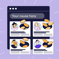
Put the fun into your fundraising profile page
Show ‘em what you got. And show ‘em how to do it!
We left the fundraising profile page/team profile page and signup page for the end of this list as optional add-ons if you want to use your website for community fundraising.
Your fundraising profile page is a template for your supporters to create their own profiles once they sign up to your campaign.
It needs to be clean, good looking and easy to use.
The most effective profile pages have:
🥅 A fundraising goal
📸 A photo (making it personal makes a difference)
📝 A description (why your supporter is getting involved in your campaign)
💰 A running total of how much your supporter has raised.
Profile pages are hard little workers. They can:
- Receive donations
- Post blogs
- Be shared via social media.
Fun and full of features.
Go team! Getting the team profile page ticking
Get your teams cheering!
Many events these days are team-based.
Fundraisers can still have their own fundraising page - but it can also be linked to their team one.
At any given moment, fundraisers should be able to see how much their team has raised (and how much they have as an individual. Not that it’s a competition, but…)
Let your supporters create or join groups, with individual totals adding to the group total.
Create leaderboards showing top-ranked teams, and encourage them with personalised team emails.
Raisely supports all sorts of team structures. You'll be getting departments, classes, and schools competing in no time.
Styling up your sign up page
This (very important) page is how people sign up to join your campaign or event.
It should be styled to fit your brand, yes.
But most of it all, it needs to be simple and seamless to use. This will ensure supporters actually complete it - while you capture the information you need.
To refine the info coming your way, try customising your fields.
The default fields on Raisely's signup and donation forms gather standard user information, but what if you need to ask your supporters for more info?
A t-shirt size or an address to send them a welcome pack, for example?
You can do this (and more) using custom fields.
And, of course, it’s about guiding supporters through the process, so make sure next steps (for example, setting up their fundraising page, creating a team etc) are clearly communicated.
Ready to launch? Here’s a ready-made checklist
Make sure your first appearance passes with flying colours.
Sure, there are bound to be a few niggles along the way. You’re only human, after all.
But ticking off these 4 steps will make it a far less daunting experience.
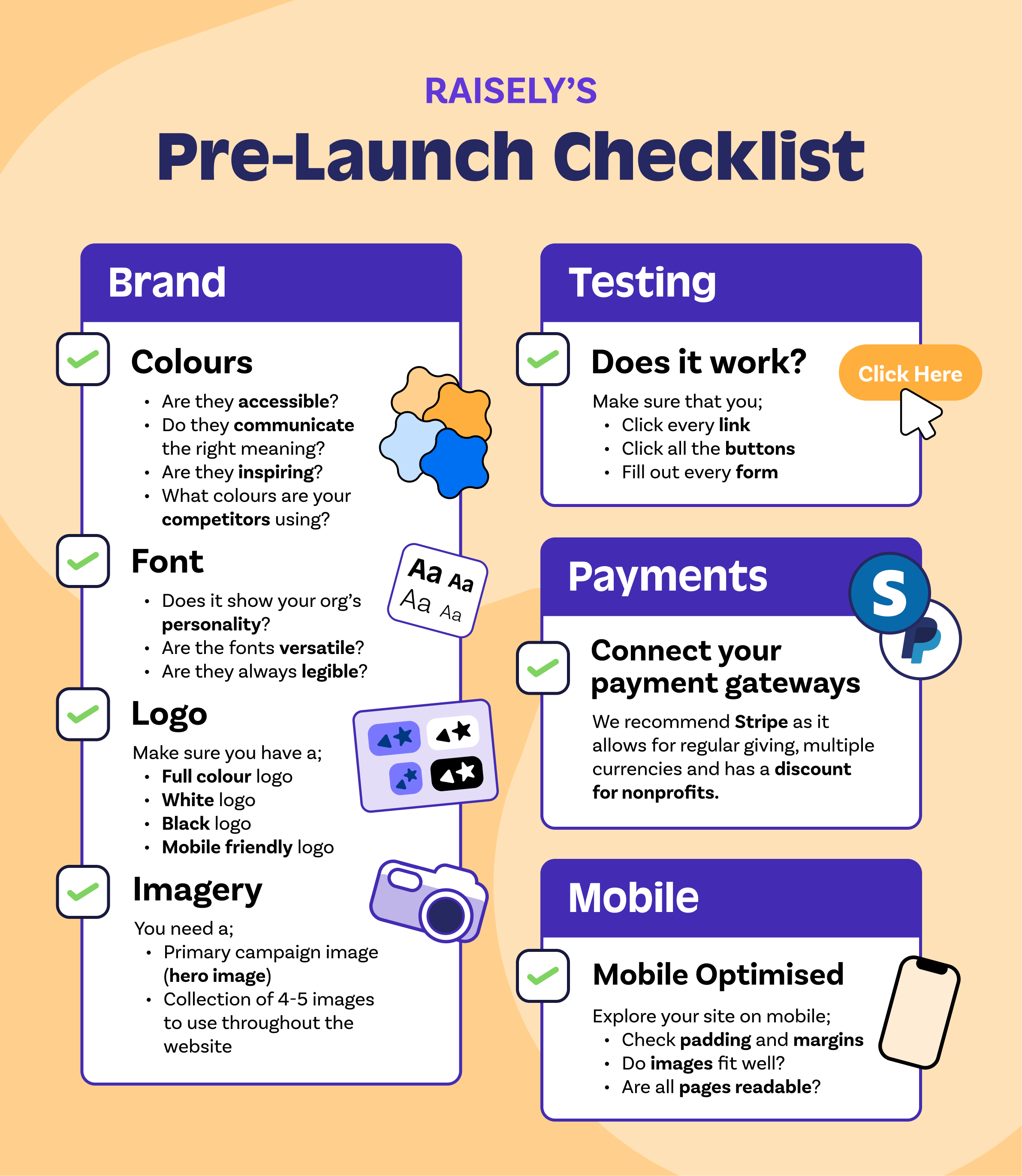
1. Get your look right
Your visual brand is part of your identity. It helps people recognise, trust and find you.
In fact, it’s such a vital part of your identity that many organisations have a style guide. This is a document that provides guidelines to follow around colours, fonts, logos and images.
This means your brand remains consistent - everywhere.
But before you develop that style guide , you’ll need to nut out exactly what your visual brand actually is.
Crazy about colour
Colours go a long way in representing your brand, how they make visitors feel and what they say about your organisation.
Here are a few things to consider when coming up with your colours:
🎨 The meaning of different colours (orange is invigorating and energetic; light blue is tranquil and calming)
💡 What colours inspire you and your team
👀 What your competitors are using
🔑 If your colours are accessible (you can use our accessibility check to make sure your colours won’t clash or make your content hard to read).
Colours really do say a lot about your cause.
All the (font) feels
Before you get overwhelmed by script vs san serif, spend some time thinking about:
- Your organisation’s personality (and be really sure about what that is). A children’s cancer charity, for example, will look different to one focusing on animals.
- How versatile a font is. You’ll likely need to use it on a number of different platforms (website, email, advertising etc.) so your font needs to work across sizes and formats.
- Above all, it should be clear, legible and readily available (not all devices or programs can display every font). And, aim for easy differentiation of letters, as well as between headings and body text.
Let’s hear it for the logo
Like your fonts, you’ll need to think about where your logo is going to appear.
Websites, t-shirts (or any other merchandise) and social media are all different. Your logo may need to be slightly adjusted to each format - but it still has to be legible, high quality and beautiful.
Make sure you have a:
- Full Colour logo (transparent background)
- White logo (designed for dark background)
- Black logo (designed for light background)
- Mobile Friendly Logo (square or portrait ideally)
Try our useful brand asset checklist if you’re unsure!
Inspiring imagery
Images really do count for a lot.
The good ones make you look trustworthy and reputable; the poor quality ones…don’t.
They can (very effectively) tell your story without words and set you apart from other nonprofits.
Try starting with:
- A primary campaign image which you can use as your hero image on the home page
- Then create a collection of 4-5 complementary images to use as you gradually build your pages.
Check out Unsplash or Burst for free stock imagery.
Also, size them up and compress them before adding to your image library. This’ll speed things up when your site goes live.
Adobe Spark Resizer and Squoosh do a great job of this.
2. Sign me up (or not)
Imagine if you get a supporter all the way to your website - and then it doesn’t work. Or it leads them down a path they don’t need to be on.
You’ll lose their support in no time. So, put your donor hat on and test it out.
You can sign up with a test account in Raisely.
Really, though, it’s about walking through it yourself and experiencing it as a supporter would.
That means clicking on every link. Every button. Filling out every form.
It’ll quickly highlight any issues and will give you a true idea of how visitors use your website.
3. Pave the way for payments
The most popular payment methods today are Stripe and Paypal. They’re globally recognised and they’re simple to get up and running.
We recommend Stripe, simply because it’s loaded with features and allows Raisely to support:
- Donations in over 130 currencies
- Secure card processing
- Regular giving
- Advanced reporting
- Fraud protection
- A discount for nonprofits.
You’ll need a Stripe account to get started. Then you’ll be off!
4. Mobile matters
It’ll come as no surprise that most of your visitors will use a mobile device to check you out. We discovered that 65% of Raisely donations happen through a mobile!
So, before you hit the ‘go live’ button, thoroughly explore your site on a mobile device.
Make sure your padding, margins, images, and all else are displaying correctly for a great user experience.
That’ll put you in your visitors’ shoes, so you can optimise your pages for each screen size.
Bonus bit: taking your nonprofit website to the next level
Keen to spice up your website even more? We can help you with that!
Think about:
Connecting to a CRM
CRM (Customer Relationship Management) software is a handy little tool for busy fundraisers like you.
It lets you manage your donors seamlessly: you can capture, manage, store and use all that juicy information your supporters share.
Because when you know more about your supporters, you can look after them better.
Raisely has built-in CRM tools to help you manage your supporters.
Or, you can use Raisely Report Builder to import, export and sync data with your existing CRM software.
Optimising for SEO
Warning: Dad joke alert 🙄
Q: Want to know where to hide a dead body?
A: On the second page of Google.
Tasteful? Not especially.
Truthful? Somewhat.
SEO (Search Engine Optimisation) is about making it easy for (the right) people to find you.
And the first page of Google (or any search engine) is where you want to be to expand your cause’s reach and potential donor base.
There are two basic parts to SEO:
- Understanding what people search for (keyword research)
- Knowing how to explain your site’s content to search engines (SEO optimisation).
Keyword research
Essentially, your website needs to include keywords that your audience is searching.
It does require some thought and research to ensure your website mirrors what people are looking for.
But getting it right will absolutely drive more traffic your way.
Getting serious about SEO
Gone are the days of ‘keyword stuffing’ (where your rank depended on how many keywords you’d used - regardless of how that affected your content).
Today, Google wants ‘value-based’ content, judged by how many people go to your page - and actually stay there.
So, it’s about quality content that is written for humans to read (not Google to rank).
Check out our tips here on SEO and getting the most out of your content.
It won’t happen overnight
It can take time (we’re talking 3-6 months) to see the fruits of your SEO labour.
But when you think about how we look for information these days (about anything), it’s worth the investment.
Over time, you’ll attract more people to your website, boost your organisation’s profile and, ultimately, raise more funds.
Getting social
Social media isn’t just for boast posts, humble brags and party pics.
It’s a must-have for any digital campaign.
In fact, 56% of all online donors say social media and email communications are the best ways to encourage giving.
So, as a charity, your job is to have some attention-grabbing, engaging content for your supporters to use.
They can draw on this to share every part of their fundraising journey across any social platform they choose.
Blogs, fundraiser profiles, donation pages and the rest - they should all be shareable.
And, make sure your pages have social media icons with links added to your site to make things even easier.
On Raisely, we know that those fundraisers who share their page from our platform will raise 79% more than those who don't.
The numbers say it all!
Blogging away
We love a blog at Raisely.
It’s another way to stay in touch with our wonderful customers, let them know what we’re up to and how we can make their lives easier.
You and your fundraisers can do the same.
People who post blogs are highly engaged and raise 97% more, but it’s rare – only 10% of fundraisers do it.
Supporters love seeing a fundraiser’s journey - from the reason they decided to sign up (such a powerful personal connection!), to training for an event (oh, the highs and lows!) and, finally, getting to the finish line.
They don’t have to be long (750-1000 words makes for a good read, but they can be much shorter) and it helps you connect, communicate and create rapport.
And every blog is an opportunity to give your cause more time in the sun.
Try it!
Our favourite charity and nonprofit websites
These organisations have done a stellar job of creating their websites on Raisely.
Ok, we might be (slightly) biased. But they’re still inspiring examples of how to build a nonprofit website and where you can take them.
SurfAid
🏄♀️ Surf’s up (and so is SurfAid’s website).
The team at SurfAid is kept pretty busy improving the lives of women and children in remote surf communities.
So, when it came time to build their website, they turned to Raisely.
And we think it’s pretty cool.
Laura Casaceli, SurfAid’s Marketing and Communications Manager, did most of it herself (go, Laura!).
Read more about how they raised 7x their fundraising goal in 30 days!
Himalayan Trust
This Kiwi charity is all about improving the health, education and general wellbeing of people living in the Solukhumbu District in Nepal.
Yet another great cause for the win.
And now their website is working wonders, too.
They’ve opted for our community hub template - nice work, Himalayan Trust.
Climate Conversations
These guys hail from Singapore and focus on getting people talking about climate change.
Awesome organisation - and now they have an awesome website.
They use Raisely’s peer-to-peer template and have also added Custom Javascript to their website.
Check out Climate Conversations here.
Still unsure? Here are a few things to mull over
Your website is unique to your organisation. As it should be!
Nonetheless, every nonprofit creating a website on Raisely can enjoy the same benefits, including:
Easy building (no coding required!)
Our easy-to-use visual page builder has an editor that mirrors your live website perfectly.
You can make changes anywhere on your site - and instantly see how they look.
Free templates
No need to create anything from scratch - there’s a template for everything!
You can add your own flair, feel and fabulousness (it’s a word) to any of our templates for campaigns spanning:
- Peer-to-peer fundraising
- Active events
- Donation appeals
- Community hubs
- In Memoriam
- Donation forms
Explore more about them here.
Unlimited pages
Are you a charity with a lot to say?
Raisely has plenty of pages for you to get chatty! In fact, there’s no limit to how many you include in your website when you build with us.
Go crazy!
Built-in blog
The Raisely platform lets your fundraisers post blogs to their pages to keep their supporters up-to-date.
They can tell their story as they progress through their campaign, and include images and videos to make it engaging and interesting.
Free hosting (yes, we said free)
No subscription fees. There’s an optional donor fee - but nothing is charged if they opt out.
You can also use a Raisely or custom domain for no charge.
Like we said - free!
Feature-rich
We’ve got fundraising features for days.
And they’re all designed to make your campaigns truly count.
We’re talking:
📑 Matched giving
🗃 Welcome emails + SMS
📊 Custom reports
And that’s just the start!
Nonprofit websites that work
Still feeling overwhelmed? Don’t!
Website renovations (or total knockdown rebuilds, as the case may be), are incredibly satisfying, totally do-able and actually a lot of fun.
And the right one can make a huge difference to your fundraising efforts.
The Raisely team would love to help you build a nonprofit website that works for you, your fundraisers and their supporters.